ShopDreamUp AI ArtDreamUp

Deviation Actions


Description
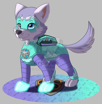
The second Paw Patrol gift to Rae-Chan13, Robin is a Red Husky.
She's a prodigy in mech and tech, often upgrading the other pups' gear and pup house. With the tools in her Pup pack and her pup house (which can turn into a supply truck), she can repair or improve any piece of technology.
Despite being so smart, she's just as playful and friendly as the other pups. She also collaborates with Rocky quite with special projects, and has a bit of a crush on him.
Image size
648x428px 12.91 KB
© 2015 - 2024 Wolf-Prince-Leon
Comments40
Join the community to add your comment. Already a deviant? Log In
Right, seeing as this is a critique let's get started...
Unfortunately I cannot see the description as before as I think it helped put this into a better context than visuals alone but, cest la vie.
Okay - I'm a stickler for linework - I like sharp, crisp, smooth lines and this looks a tad jaggy around the edges. At first glance (nothing wrong with this by the way I use it myself from time to time) it looks as if this was made in MS Paint or a smiliar application which adds its own challenges when creating a piece of work as mistakes are punished harshly (especially when you do a great piece of linework in one swoop and mess up a tiny piece then hit control z and it disappears - most frustrating!) with no real means of cleaning it up without a long winded series of rebuilding.
If the linework was smoothed over a little bit, perhaps starting with a larger image and compressing it with a higher resolution, it might lose the jagged edges that make it feel a bit rough (ruff! <img src="e.deviantart.net/emoticons/g/g…" width="17" height="15" alt="
The actual anatomy of the critter is pretty well done, it looks canid/canine and the perspective is fine. Quite a good pose as it captures the character and is, as seen, a handy refernce point for building on armour and accessories, so yes, that's a good point.
The rendering is good - none of that weird blank pixelling that happens when the fill tool is first used so they have paid attention to detail when rendering.
A bit of sparkle in the eyes makes the character look a bit more alive than without it. A good candidate for a fiction/fantasy story I'm sure.
The colourscheme is good too, red white and black play off of each other making a strong, eyecatching image. The flat colours (e.g. no additional shading or ligher hues around percieved points of light) gives it a cartoony feel which I quite like.
The second image, where the character is in some sort of bionic armour is quite well done, though because I'm not wearing my glasses (forgot them today - damn!) I cannot tell if the armour is segmented into plates or is more of a rubber sheet or nanomaterial like a fabric - possibly reactive against projectiles and energy attacks than traditional armour plating which just takes the hits without much more to be said.
The circuitry is a nice touch and adds to the bionic feel - as if it is integrating with the characters physiology, making them like a cyborg when in this state (just spitballing due to previous experience - I could be quite wrong)... An established concept, but one that a lot of people do like and seems to be a part of our sci-fi genre.
I think this would be interesting to see animated, certainly the character in an animation or epidode to really let us see who they are and what else the artist has really put into developing the character overall.